
Anaheim Brewery is a local institution with roots dating back to 1870. After closing during Prohibition, the brewery was revived in 2011, bringing its storied legacy back to life with flagship brews and seasonal drafts.
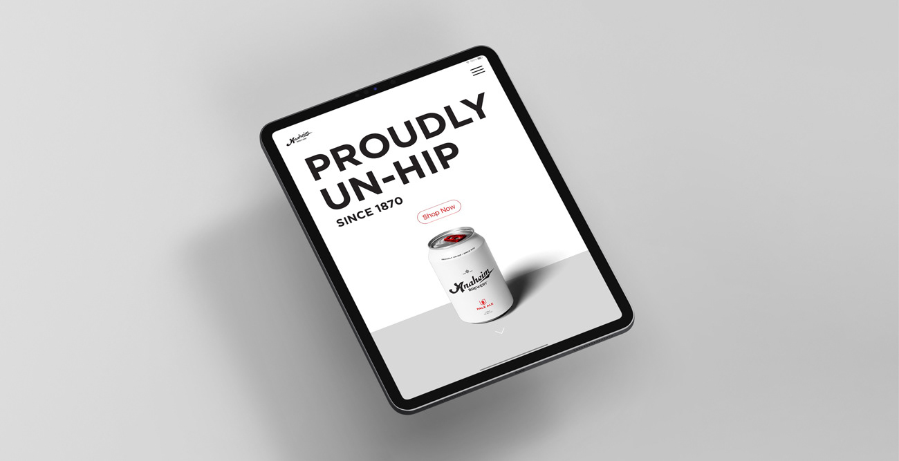
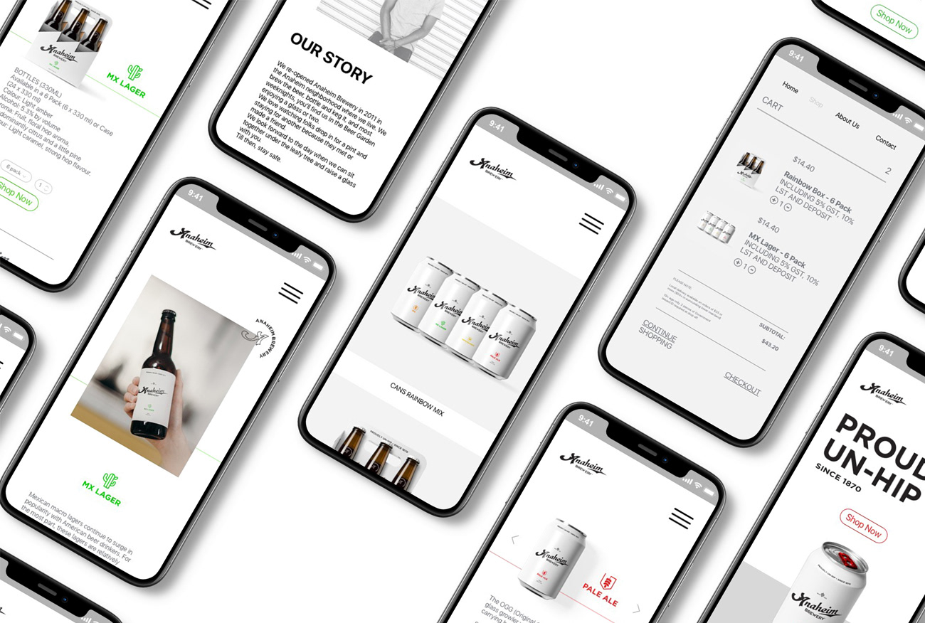
Our team strategically positioned Anaheim Brewery as authentic, dynamic, and refined. We developed a sleek, customer-focused interface tailored for web, mobile, and tablet to engage tech-savvy Gen Y users while catering to a broader audience. The product page redesign simplified storytelling content, addressing issues identified through heatmap analysis, and improved user interaction. The result was a confident, refreshed brand identity ready to compete on the national craft beer scene.
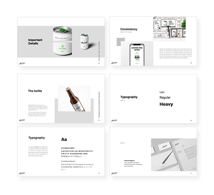
The rebranding launch included a comprehensive digital campaign, print collateral, packaging design, and merchandise, ensuring a cohesive and impactful introduction for the updated brand.
Modernize
Create a story & example the customer base. The challenge was to expand the brand, keeping the authenticity and the trust gained during the years. The solution was renovating their identity without denying the core value of the brand. Genuine with a bold legacy mixed with a forward-thinking approach to suite craft beer fanatics. To build a solid story we had to research in the archive of the brewery to find valuable content to reshape and elevate.

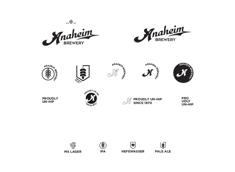
Responsive Logo + Personalized Icons
Refine & define
To build out the visual language, we had to make sure to keep the elements from the heritage and modernize them. We crafted a system of icons and symbols.
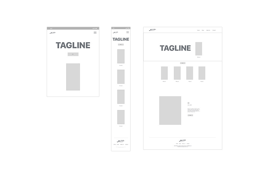
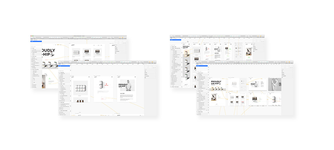
Responsive Wireframe
Responsive UI/UX
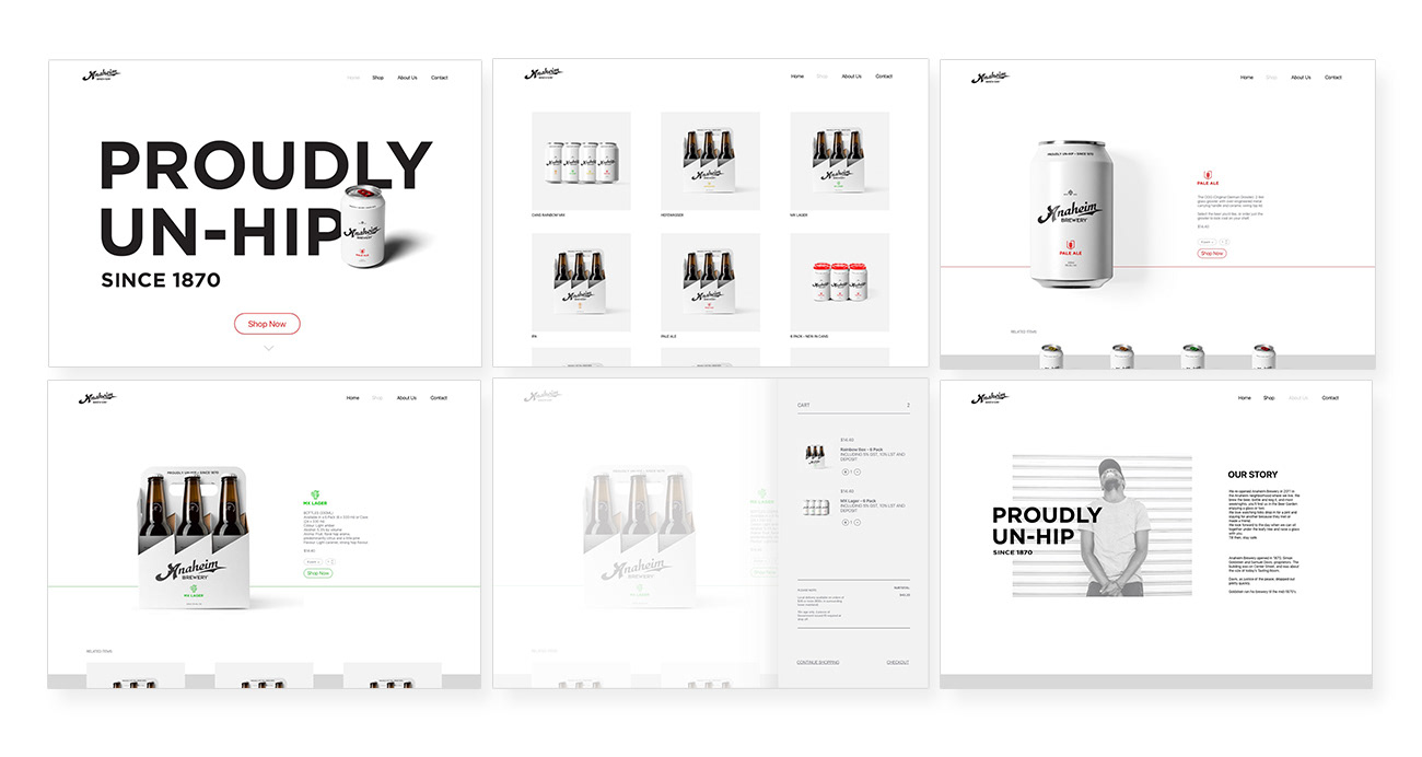
Desktop
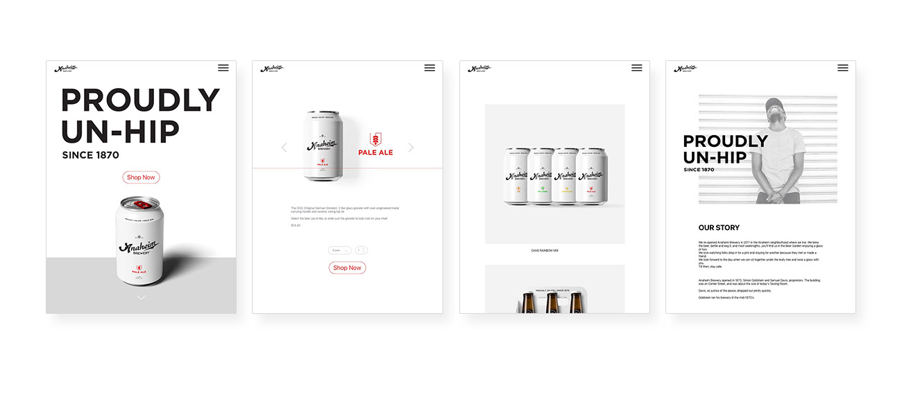
Tablet
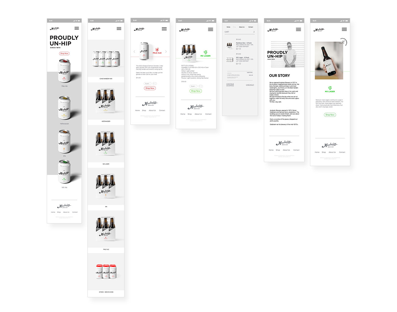
Mobile
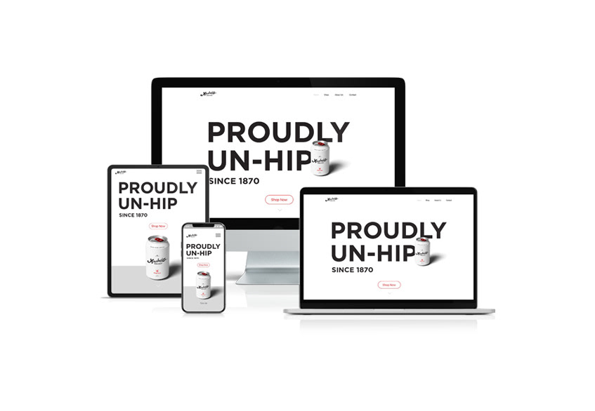
Responsive Webdesign